2024 IBL All-Star Game Jerseys
This professional commission involved the complete concept development and design execution of both the North Division and South Division uniforms for the 2024 Intercounty Baseball League (IBL) All-Star Showdown, produced by TRI3 Hardgear and unveiled publicly by the Welland Jackfish. The project demanded the creation of visually compelling, production-ready jersey systems that authentically represented the cultural and geographic identity of the "Rose City," while meeting the rigorous constraints of commercial apparel manufacturing and sublimation printing workflows.
Problem
To develop two fully realised All-Star jerseys—North and South—that honoured the identity of Welland, Ontario while remaining sufficiently distinct to represent opposing divisions. Each jersey needed to integrate the city's defining iconography (notably the vertical-lift bridge), operate within TRI3 Hardgear's sublimation-printing constraints, maintain legibility at distance, and conform to professional sportswear standards.
Constraints included:
- Maintaining a shared visual language between divisions while preserving unique colourways
- Ensuring artwork remained scalable and distortion-safe across multiple garment sizes (S–XXXL)
- Designing exclusively in vector format with strict colour-layer separations
- Working within TRI3 Hardgear's production tolerances (bleed, stitching overlays, panel curvature)
- Creating promotional assets suitable for league-wide public release
The design had to be both symbolic and functional, carrying cultural meaning while sustaining on-field clarity.
Approach
The design strategy separated the project into three core systems:
1. Regional Identity Layer
The narrative: bridges, canals, northern lights, sunsets
2. Event Branding Layer
The All-Star typography, numbering system, and graphic environment
3. Production Layer
Panel mapping, colour handling, stitching alignment
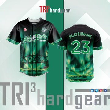
North Division ("Aurora Over the Canal")
A darker, atmospheric identity inspired by northern Ontario evenings.
- Emerald and neon gradients evoke an aurora-like visual field
- The Welland vertical-lift bridge rendered as a deep structural silhouette
- High-contrast lettering for stadium visibility
- Aggressive, energetic mood intended for the "Northern" team identity
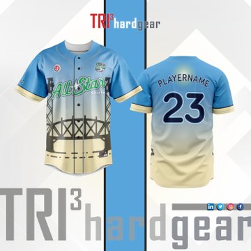
South Division ("Bridge at Golden Hour")
A lighter, community-oriented visual theme.
- Sky blue and warm beige gradient referencing Welland's lakefront sunsets
- Same bridge silhouette—reinterpreted with softer tones
- Deliberately welcoming, bright atmosphere for the "Southern" identity
- Balanced contrast for clear number visibility
Multiple concept sketches were developed exploring geometric vs. organic motif structures, gradient behaviours, and regional symbolism. Final selections balanced narrative fidelity with manufacturability.
Methods & Tools
- Vector development in Adobe Illustrator (AI/EPS master files)
- Colour-profile control for sublimation CMYK workflows
- Panel-safe layout mapping for sleeves, torso, and button plackets
- Gradient behaviour testing for print integrity under curvature
- Typeface manipulation for custom All-Star script
- Design for production tolerances (bleed zones, seam drift, size scalability)
- Creation of marketing assets published by the Welland Jackfish
This process mirrored professional sportswear pipelines used by commercial teams and leagues.
Outcome
- Official release and public credit by @WellandJackfish, viewed widely across league and regional audiences
- Designs adopted as the exclusive uniforms for the 2024 IBL All-Star Showdown
- Delivered fully print-ready technical files to TRI3 Hardgear
- Generated significant engagement and visibility for the event
- Successfully created two visually cohesive yet emotionally distinct jersey identities
Impact
This commission demonstrated my ability to translate regional culture into visual language, deliver manufacturing-grade sportswear design, and operate within a professional-client workflow from concept to public release. It strengthened my portfolio with a real-world, publicly adopted design used in a high-profile sporting event.
Key Leverage
This project highlights the synthesis of design storytelling, manufacturability discipline, and professional-grade execution. By grounding each jersey in the cultural narrative of the Rose City and aligning artwork with the practicalities of sublimation apparel production, I demonstrated an ability to operate fluently across conceptual, aesthetic, and technical domains. The final uniforms served not merely as event gear, but as visual ambassadors of place, identity, and sporting celebration.